I tried out Gnome Shell today. (And it didn't break everything! I followed their instructions it build and ran fine, and when I killed it, my normal environment with the normal Gnome Panel and Compiz... went back to normal.) Its shaping together nicely, there are many good things and I think its a great effort by everyone behind it. (But just a warning I don't know all the technical things behind everything here, so please excuse me if I miss something or don't use the correct terminology. This review is just from my perspective/my view. It is not a proper usability evaluation, nor have I looked and which is better engineered or anything too technical.)
[caption id="attachment_812" align="aligncenter" width="450" caption="My Desktop Running Gnome Shell"]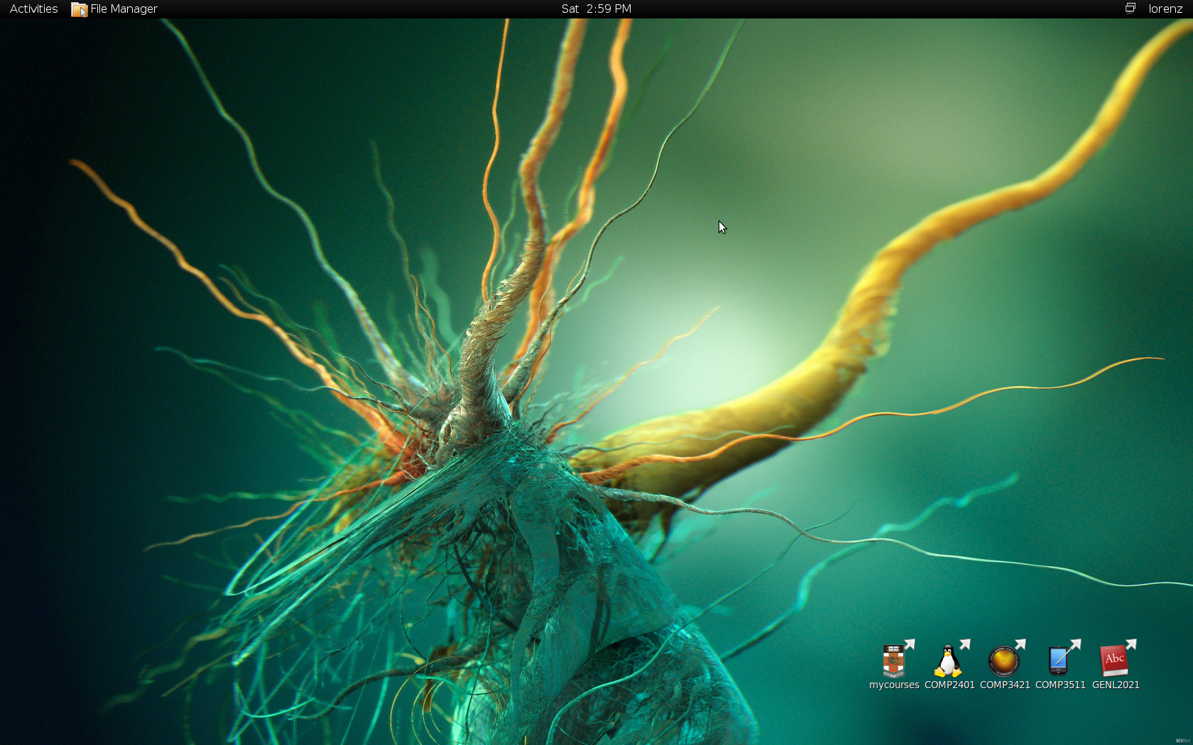 [/caption]
[caption id="attachment_814" align="aligncenter" width="450" caption="My Desktop Running Gnome"]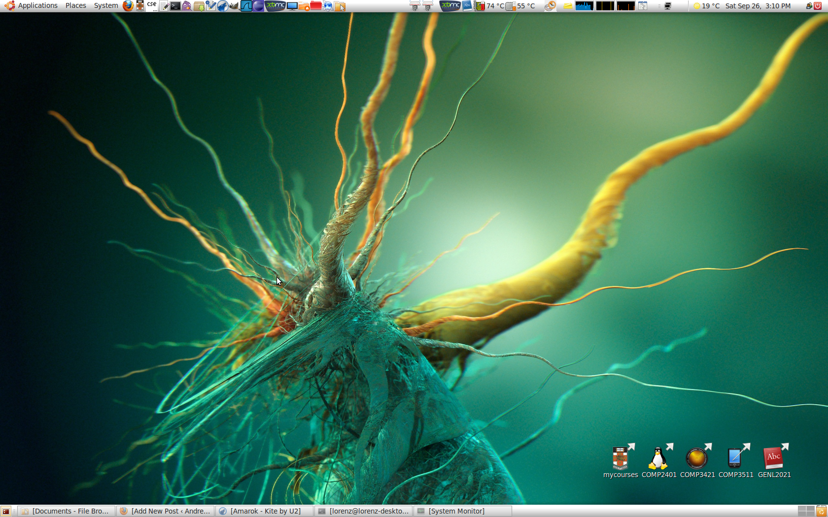 [/caption]
The obvious difference is there is no bottom panel in Gnome Shell and the top panel is different (but its still in development of course so in a later version they may make more use of it).
My Current Work-flow
Window Management
Normally in Gnome I use Compiz a lot to help me manage my open windows. Compiz/Compiz Fusion has a lot of plugins, but over time I've found a few which I really like and I use all the time.
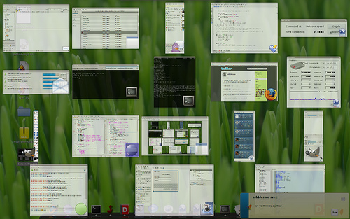
If I have a bunch of windows in one workspace and I want to switch to another I usually use Scale (shortcut of Super + Tab), although I still sometimes use the bottom taskbar, and I always use that taskbar when the window is minimised (Because Compiz can't access minimised windows pixmaps so they don't appear in Scale unfortunately. This is a real killer.). I can also right click on a window in this view to close it. This makes it really easy and fast to kill a heap of windows that I have finished with. This makes my search space when changing windows much less and hence much easier.
[caption id="attachment_818" align="aligncenter" width="450" caption="The Compiz Fusion Scale Plugin"]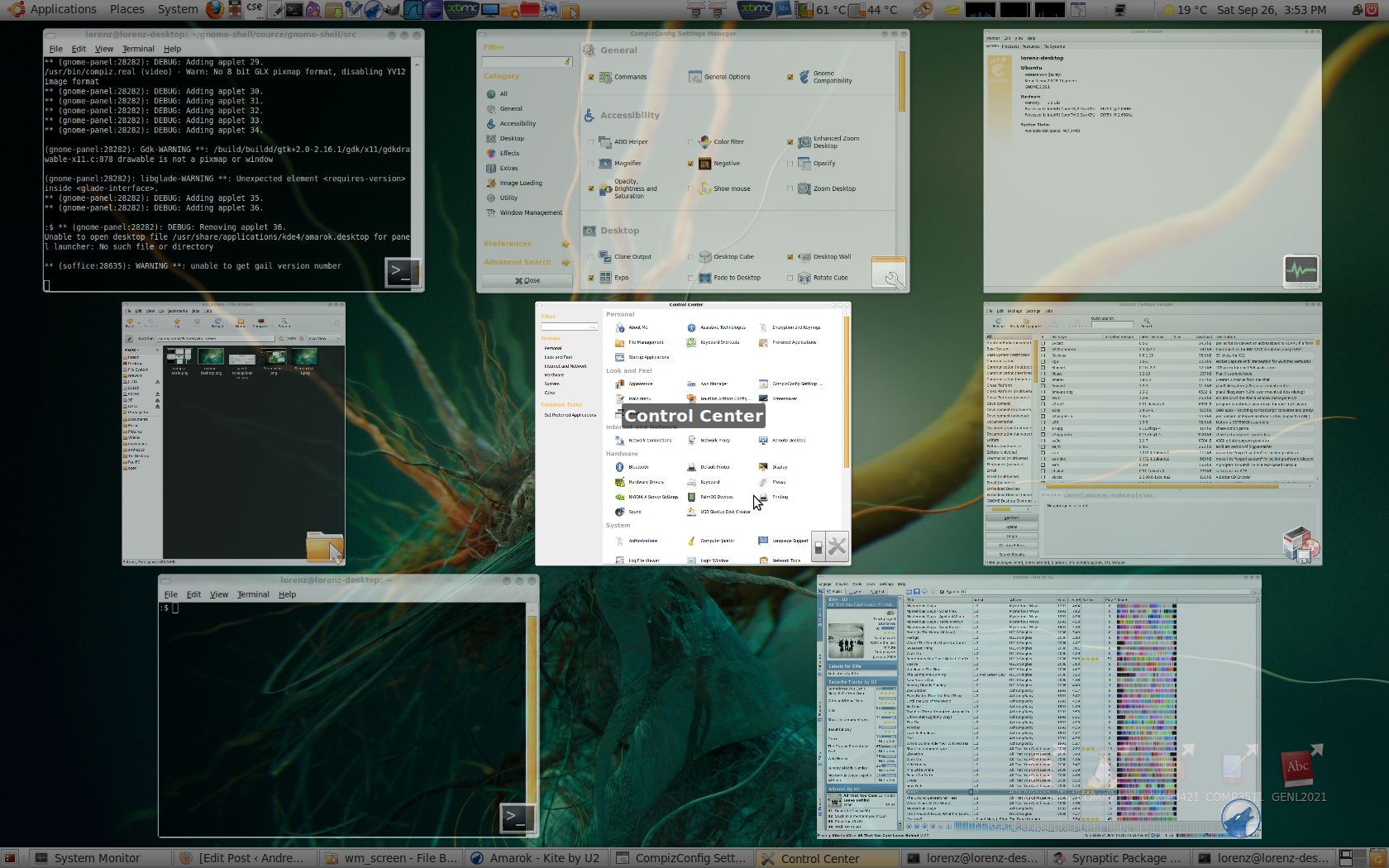 [/caption]
To change workspaces I use Expo (shortcut of Super + E). But I don't actually use more than I workspace all that often, even though I think I should be. The other great thing is I can drag windows from one workspace to another while in Expo.
[caption id="attachment_819" align="aligncenter" width="450" caption="Compiz Expo Plugin"]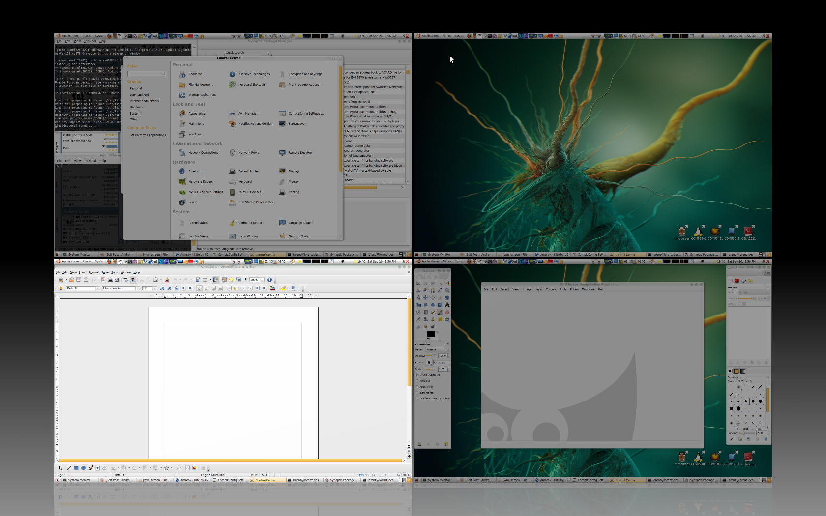 [/caption]
Some other shortcuts I use for window management very frequently are,
- Alt + Left Mouse to move a window (with the great wobbly windows effect)
- Alt + Middle Mouse to resize a window.
- Alt + Right Mouse to close a window.
- Super + Scroll to zoom in.
- Ctrl + Alt + (1-9) on the keypad to place a window in a grid. This is great for getting say a terminal to run your program next to the editor with the code. This gives me the benefits of a tiling window manager such as xmonad (although changing the window focus between two side by side windows is not as easy as it would be in xmonad)/an arrangement similar to what you can get using Terminator.
- Super + Shift + (Up Arrow/Right Arrow) to extend a window to the maximum extents in a vertical/horizontal direction.
I keep making refinements to this, but it works very well for me as it is.
Application Starting
In Gnome I use the Panels Run Application dialogue (see pic) (with the shortcut Alt + ) and the terminal (with the shortcut Ctrl +) to start new applications. Those shortcuts really make things easier and faster.
[caption id="attachment_815" align="aligncenter" width="450" caption="The Panel's Run Application Dialogue"]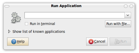 [/caption]
The run dialogue is good. I can run programs like firefox, gedit just as you would in the terminal but it means I don't have to have a terminal open or open one first (its all amount maximising efficiency, so I can get to where I want to be as fast as possible). Also I can enter locations such as /etc/whatever and Nautilus will be opened to that location. That text box has tab completion (and it actually shows the suggestions) which makes things easier and faster.
In Gnome Shell
[caption id="attachment_821" align="aligncenter" width="450" caption="Gnome Shell Activity Mode (sorry, I'm not sure what its actually called)"]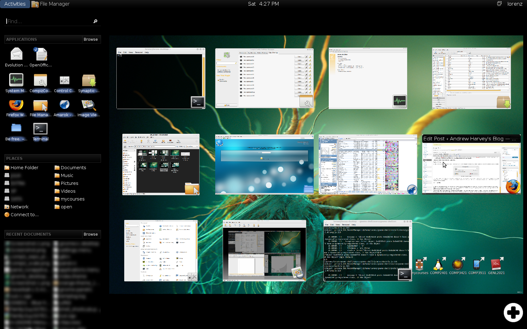 [/caption]
Window Management
In Gnome Shell (it uses Metacity not Compiz) you can do all your window management and application starting through the Activities mode. Which can be started either by the Super key, clicking Activities, or dragging the mouse to the top left edge (although it seems I must go to the exact 0,0 pixel not 0,1 or 1,0 which is a bit annoying). This is good it gives the user some choice they may happen to have their hand near Super so they use that, or they may only using the mouse so they can use that (actually I will set up Compiz Scale to work with both Super Tab and a top left mouse move).
On the down side, Gnome Shell did not seem to be as fast and responsive as similar Compiz tools. What I mean is that on my system where the Scale tool is fast, as in the windows move smoothly and quickly, when I go into the Activities mode its has a small delay (less than a second, but its still annoying) and its seems a bit jumpy and jerky when everything is moving. But of course its still in development so I'm not going to criticise this. Apart from this, it seems just like Compiz Expo + Scale together. This activity mode window management is good, but there are some small things like I can't seem to close windows from this activity mode (like I can in Compiz's Scale), but I can move windows from one workspace to another in Gnome Shell just like in Compiz's Expo. Also it can also be annoying to have Scale and Expo mixed together (of course I can just just Alt + Tab or move windows around so I can focus on another, but I don't really like that idea).
Unlike Compiz/Gnome's multiple workspaces, in Gnome shell you can add these dynamically. Which I think is a better idea than the static type that normal Gnome/Compiz uses.
[caption id="attachment_822" align="aligncenter" width="450" caption="Gnome Shell allows you to dynamically add/remove workspaces"]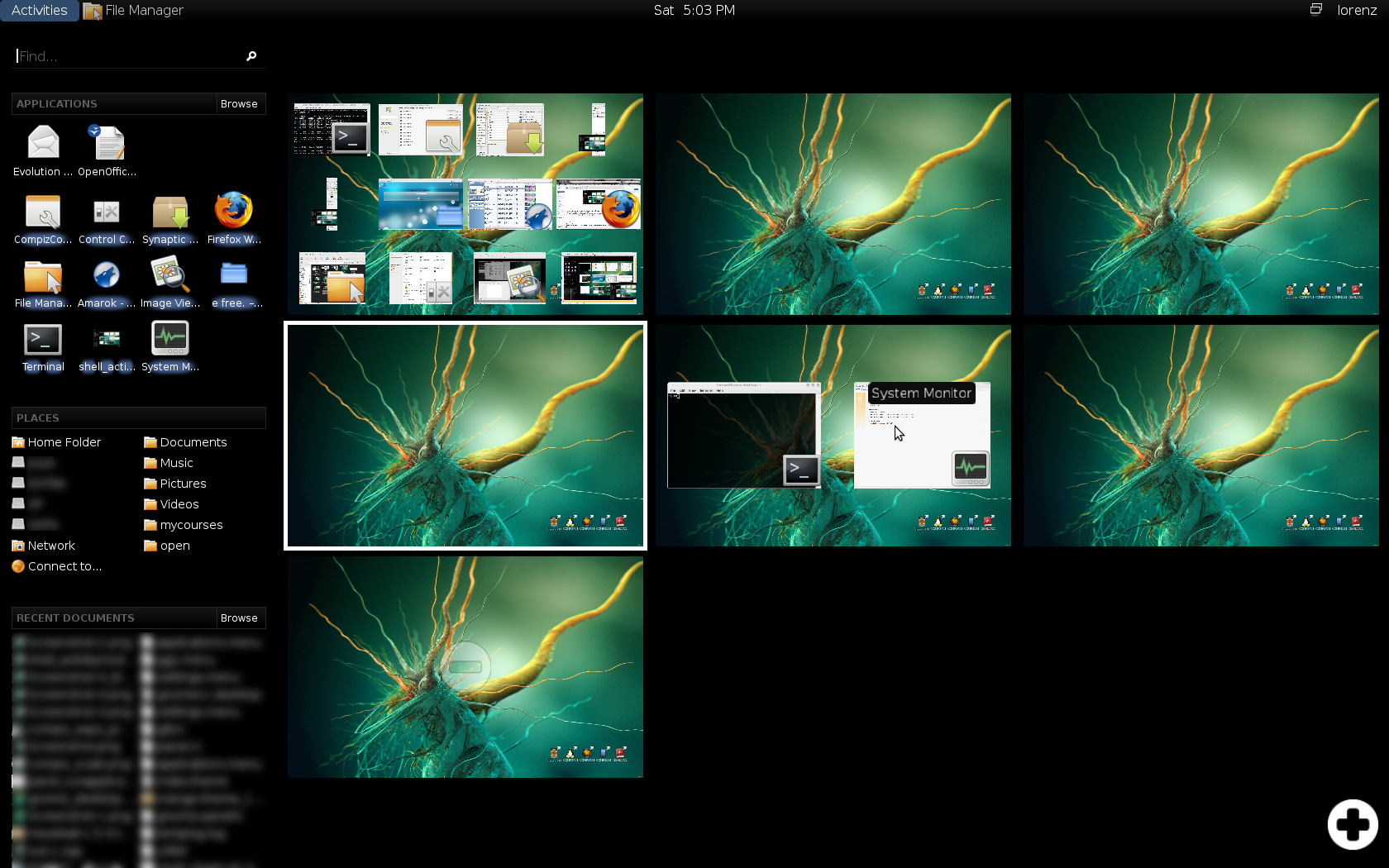 [/caption]
Things seems to be shifting towards emphasising multiple workspaces. What I need to try to remember to do is USE these multiple workspaces, grouping windows together where they group nicely, instead of just putting everything in one workspace. Window managers could help me with this, like they could remember that I often have Firefox on workspace 2, so when I run it automatically put it there and switch to workspace 2. I haven't tried this, so I don't know if it would help me, or just frustrate me by doing what I don't want every time. I'm not even sure if Compiz can do this anyway.
I'm not sure where dock's like Avant or Cairo fit in, but I never really found them to make things easier.
Application Starting
The other noticeable thing in Gnome Shell is that bar on the left. In normal Gnome you have your menu bar which has Applications, Places and System (which I wish I could easily shorten to Apps, Places and Sys to save space). Given I have this new user thing on the right where I can shutdown/logout/suspend/hibernate... from the only real thing I use System for is the Preferences and Administration. Yet I can never remember if what I want is in admin or pref. I recently discovered this system preferences thing which just puts it all in one window categorised into appropriate groups. I'm sure some find the two lists easier and some find the single window easier. When I scan with my eyes in a list I just go up/down, but when I scan a grid my eyes wander all over the place with no apparent system. As such its probably a more random search than a well defined one. There is heaps of things you could test out (we looked at some in my HCI course) to try to make the grid layout faster but nonetheless I think I like the grid better.
I use the Places bar often, and I think the Gnome Shell implementation makes things easier as they are listed in two columns, unlike traditionally where the number of bookmarks is limited and I need to navigate to a sub-menu to show them all. It seems I can't change the size proportions of those three sections on the side, but again its still in development. You could look at this a number of ways but because the panels are gone, if you are using a full screen application you can focus on that, with nothing cluttering the edge or distracting you from your task at hand. Traditionally everything in layered down, you have panels, then window decorations then menu bars, status bars, tabs (in Firefox), removing all that so that you just have the task at hand in your vision can be a great thing (yes I know there is a full screen feature in Firefox, and you can set Gnome panels to hide). When you are working in a browser its up to the web site (unless you have the time to do some Greasemonkey scripts) to allow you to again remove outside clutter, yet many application-like web sites allow you to do this (Alt + Shift + G when editing in Wordpress, u in Google Reader (to some degree)). Anyway that is moving away a bit from the topic of this post.
At the bottom of the left bar, you have recent documents. I use recent documents very very rarely (as in the shortcuts to them, not the documents themselves). Although I still think that a well designed system for access to recent documents integrated with some kind of search capability would be very useful for me, and I would use it often. However I am yet to find such a system that I like. The concept in my mind is something like the Lifestream design that Wei Zhou blogged about. An interface where time is on the horizontal axis, where you could change the scale and location of this view easily, view related things such as the weather for that particular time, your location if you have a GPS enabled laptop, etc. Also it should be integrated with a good filter feature (anything such as file type, file size, location, tags...) that lets you narrow down your search space. Something like that is what I have in my mind as a great use of a "recent documents" feature. GNOME Zeitgeist looks like it may address some of this.
Lastly the top section is the application launcher.
[caption id="attachment_825" align="aligncenter" width="450" caption="Gnome Shell Menu"]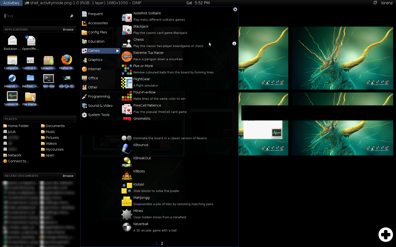 [/caption]
The actual menu in some ways is much better than the normal Gnome menu. Larger icons and a short description of the application are good. When I open the Gnome menu bar, I never need to see what's on my screen in order to make my selection from the menu bar (and if I forgot what I wanted to start I can always close it then open it again). You have the whole screen so you may as well use it, and Gnome Shell seems better in this respect. The bad thing is I don't like the use of pages. If not everything will fit on one column, you have to change the pages at the bottom. Instead you should be able to scroll through the options with the mouse wheel, or the ones that don't fit go in another column to the right (like Windows XP can do, and yes I used to use Windows XP).
The search box above this doesn't behave like the traditional Gnome Panel's Run Application dialogue. For example I can't type a file path, and tying gedit then enter won't take me where I want to go (gedit). Instead it takes me to some other entry I have defined in the menu bar. Now I can see some reasons why this could be better. Really I want to launch any executable files in my $PATH, but a user who doesn't use the terminal probably doesn't want this. An option so that the user can choose how they want it to behave would be better, I think.
[caption id="attachment_826" align="aligncenter" width="450" caption="Gnome Shell's search box doesn't behave as I expected."]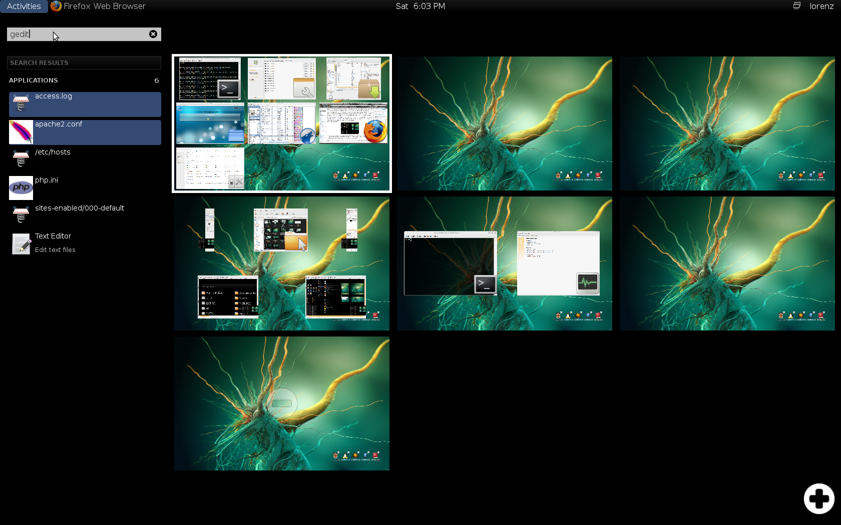 [/caption]
Having all my icon application starters in the top Gnome Panel was nice but there is no reason those can't be added to Gnome Shell, but again it's still in development. Although now that I've been using the interface for an hour or so, I think that they may create more clutter. Actually I think I would prefer that that top panel bar in Gnome shell would only appear in the Activity mode (but still recognise the top left mouse gesture). Although this may be scary for newbie's (hey I got intimidated the first time I used Blackbox, I couldn't work out that right clicking on the desktop gave me a menu) so an option would be much better.
Anything thing I wanted to mention was, I use Firefox a lot, and a lot of the concepts and issues with window management can be applied to tabs in a browser. The folks over at Mozilla are working on this so I'm eager to see what they come up with, but as more and more things are done through HTML web pages, it just means I'm going to have more and more tabs open that I need to manage, and navigate. Like starting a new application in a desktop environment you often start a new task (web page/tab) in a web browser. I've been using Ubiquity for a while now at I find it really good. Although they are up to release 0.5, I'm still using 0.1.9rc6. Although I can think of many improvements, its still really efficient at starting new tasks.
Oh an in case you were wondering from my Screenshots there, I'm using the orange-theme (orange-theme - 1.3.0.jaunty.ppa2+nmu1) from https://launchpad.net/~bisigi/+archive/ppa/+packages.
