avatar tianjara.net | blog icon Andrew Harvey's Blog

Entries from November 2012.

The light is near: Fun with vector tiles
20th November 2012

Small side projects come an go yet I always seem to come back to the task of trying to showcase ABS census data geographically.

In the backend I have built a soild foundation for providing the base geography. That part is quite stable now. The backend for providing the census data is in pretty good shape now, just some polishing of the edges to do.

The real milestone I've hit now is getting those census regions on a slippy map as vector tiles (tick on those ASGS 2011 overlays, only some regions/zoom levels/layer combos available at the moment though).

I've done this using the excellent TileLayer.GeoJSON provider for Leaflet in combination with the TileStache PostgreSQL vector provider with the vector-simplify patch for TileStache to perform zoom dependent geometry simplification.

I think this will result in a really neat design as you can apply endless thematics to these geometries client side, you just need to pull in the census data as a simple JSON and join it to the geometries. Plus you get all the benefits of vector tiles such as hover effects and clickability.
Tags: geo.
Visualising the Bureau of Transport Statistics NSW CityRail Station Barrier Counts data
17th November 2012

The Bureau of Transport Statistics NSW is actually one of the few NSW government departments to release data or works under a free license. This means that the public is actually allowed to use this data, so that is what I have done.

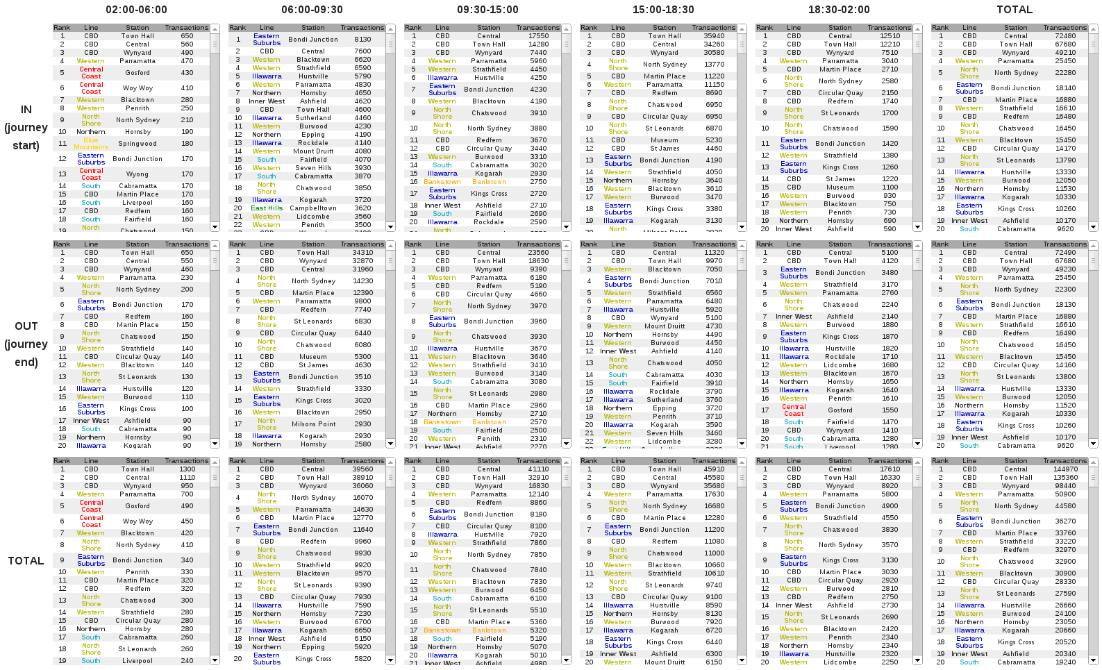
My first visualisation is tables of train station barrier counts, with all source code on github.

A series of tables showing train station rankings by transaction for
different time periods and travel directions Tables of CityRail Train Station Barrier Counts. Based on Bureau of Transport Statistics data.

Looking at statistics I find that they usually just confirm what you already know. But some interesting observations from the tables include,

I encourage you to take a look at the tables for yourself though.

I've got plenty ideas for more visualisations, but my JavaScript skills especially with wrangling data in D3, don't quite cut it yet.

You could do a list of all stations along with a 5x2 grid (so one cell for each time period X in|out) choropleph, or include a geographic map emphasising the values for each station for the selected direction and timespan.

Tags: data.

RSS Feed