The Bureau of Transport Statistics NSW is actually one of the few NSW government departments to release data or works under a free license. This means that the public is actually allowed to use this data, so that is what I have done.
My first visualisation is tables of train station barrier counts, with all source code on github.
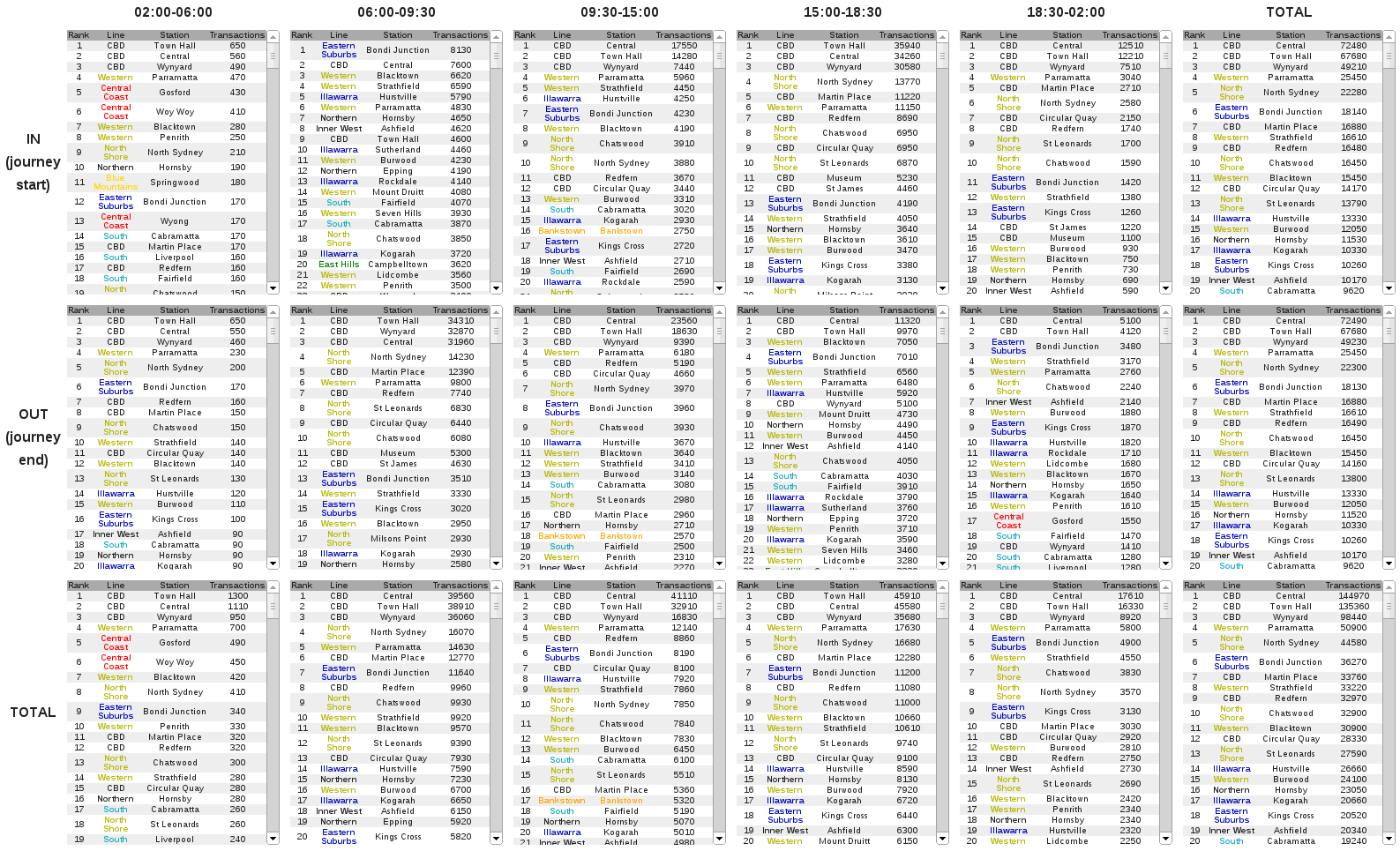
Looking at statistics I find that they usually just confirm what you already know. But some interesting observations from the tables include,
- Bondi Junction has the largest IN for the morning peak. Presumably because the whole eastern suburbs descends onto this single station.
- In the morning peak the most popular stations for people to exit are Town Hall, Wynyard, Central, North Sydney, Martin Place, Parramatta, Redfern...
- The stations further away from the City such as Gosford, Woy Woy, Blacktown are up there in the pre 6am station entries. Makes sense as they need to leave earlier to get to the City the same time as everyone else.
I encourage you to take a look at the tables for yourself though.
I've got plenty ideas for more visualisations, but my JavaScript skills especially with wrangling data in D3, don't quite cut it yet.
You could do a list of all stations along with a 5x2 grid (so one cell for each time period X in|out) choropleph, or include a geographic map emphasising the values for each station for the selected direction and timespan.