I've recently read an article which has given me a huge insight into some cartographic principles. Principles which I had been using were given the rigour they deserved.
What I gain most from it was that one kind of map among many is the physical map. The physical map is designed to portray the feeling of the environment. One way to do this is to use a suitable base landcover palatte as suggested in the article, combined with relief shading and textures to represent the environment to the fullest extent.
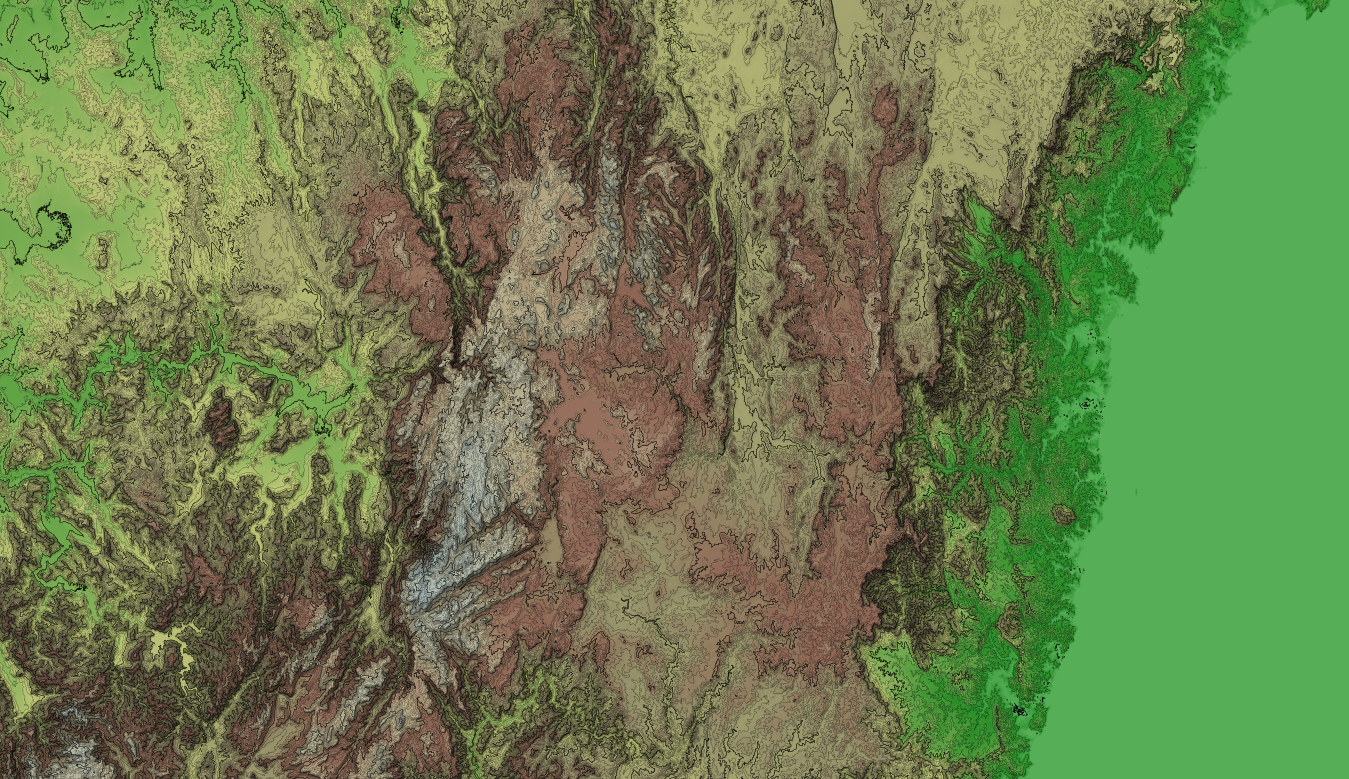
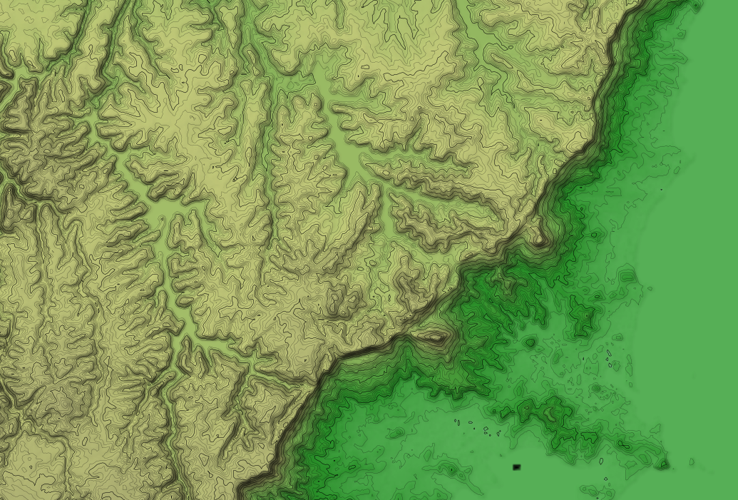
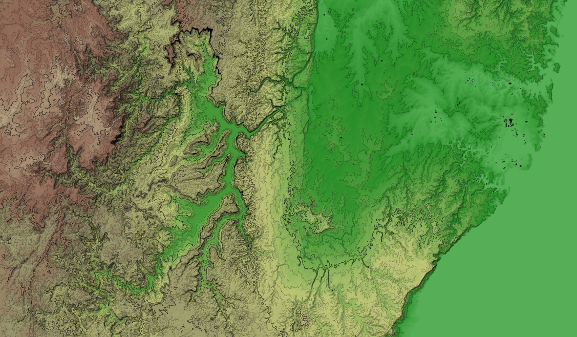
The use of hypsometric tints is debated. Personally I think that every map feature is fit for a purpose and hypsometric tint are no different. It is deciding what you want your map to show, and how you are going to combine these features into a single map to make it multi-purpose.
Hypsometric tints are useful for showing elevation levels (no surprise there). So for showing points above a certain altitude where the air may be getting thinner, or comparing which of these two mountains is higher, or by gauging if this is just a small hill or Mount Everest.
Contours are good for showing steepness (how close the lines are together) and identifying the gradient of a paths by if the path runs parallel or orthogonal to the contour line.
Shaded relief is great for getting a general sense of where the hills are and their form.
Physical coloured landcover combined with textures or representative bump maps give you a feel for the environment.
The next task is building up a physical map which gets applied to OSM data (possible in tandum with other free sources) which uses natural colours, shaded relief, textures and bump maps. The only question is whether to build something like the Stamen watercolour maps but with natural colours and textures, or instead work towards a natural style for osm2world (or any other osm to 3D world program).


