I've managed to do a couple things all in one here. I've made use of some Geoscience Australia Creative Commons licensed material, in a nice little program with a web API, and I've aggregated some data from the myschool scraper and parser. Putting them all together gives some nice images like this.
The program for generating these images basically takes an SVG template file with placeholder markers and then fills these values based on the CGI parameters. The API is fairly simple so one should be able to work out how to use it from the example in the README file. Here are the files I used to make the graphs (and the svg versions as Wordpress.com won't let me upload them to here).
ps. This gets cut off when viewing it from the default web interface of this blog, use print preview or even better look at the RSS feed to see the cut off parts. Also I tried to ensure the accuracy of the data, but I cannot be 100% sure that there are no bugs, in fact there are discrepancies with the averages I get from my scrape of myschool and the averages provided in the report on the NPLAN website. The numbers I get seem to be consistent (ie. the state rankings seem mostly the same), but nonetheless not exactly the same as those reported in the report. Although I would be very surprised if all the numbers I got were exactly the same as in the report. I mainly did this to use map/graph code I wrote, so if you really care about how certain state averages compare in these tests look at the reports on the NPLAN website.
The lighter the colour the higher the number.
Primary
| 2008 | 2009 | |
| Literacy | 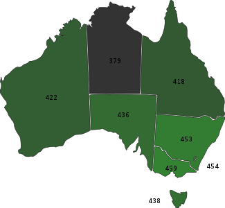 |
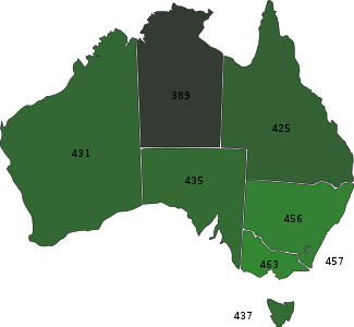 |
| Numeracy |  |
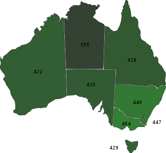 |
| All |  |
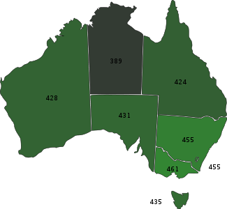 |
Secondary
| 2008 | 2009 | |
| Literacy | 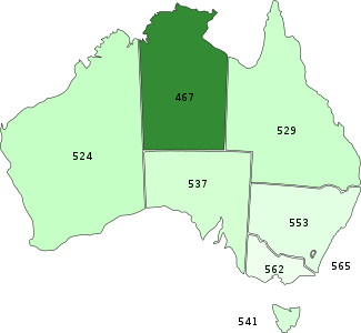 |
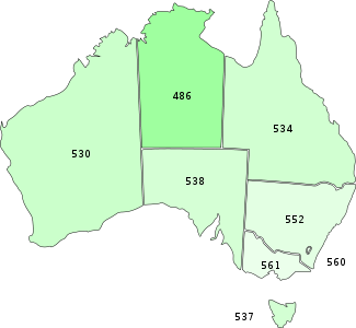 |
| Numeracy |  |
 |
| All |  |
 |