avatar tianjara.net | blog icon Andrew Harvey's Blog

5th November 2013

A few weeks ago surrounding Sydney was facing some serious bushfires. Like a lot of other people, I wanted information. Information on where the fires where and when they were there so I could plan which areas to best avoid.

RFS Incident Map

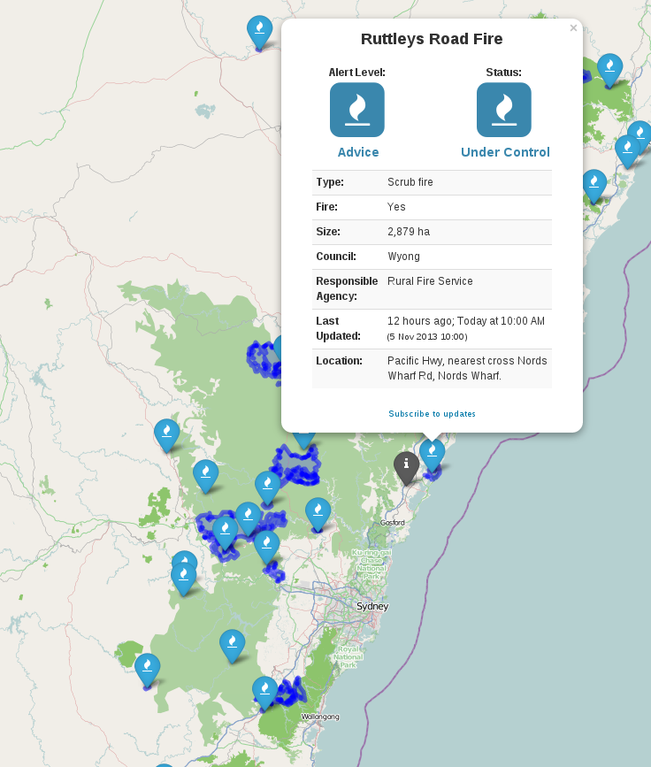
The RFS do have a map on their website to show this, but I was frustrated by their tiny map and its poor usability.

Clicking each marker gave you a popup which filled the whole map window making it very hard to close again and pan around.

So I set off and quickly hacked together the basics to take the data their map and place it on a full screen Leaflet map.

Currently map.rfs.nsw.gov.au goes nowhere, so I built the website I expected to get by going to map.rfs.nsw.gov.au and I now host it at http://tianjara.net/rfs

There was some initial pain with consuming their GeoRSS feed but I managed to resolve that. I'm also quite pleased with the nicely formatted popups. They are highly visual and easy to read (eg. "2 hours ago" rather than a full date time string).

I've released the whole site under the CC0 license. http://github.com/andrewharvey/map.rfs

I've also sent off a note to the RFS explaining my motives and what is wrong with their map and that hey here is an example of how to make it better. Unfortunately I've hear nothing back from them.

Tags: geo.
20th November 2012

Small side projects come an go yet I always seem to come back to the task of trying to showcase ABS census data geographically.

In the backend I have built a soild foundation for providing the base geography. That part is quite stable now. The backend for providing the census data is in pretty good shape now, just some polishing of the edges to do.

The real milestone I've hit now is getting those census regions on a slippy map as vector tiles (tick on those ASGS 2011 overlays, only some regions/zoom levels/layer combos available at the moment though).

I've done this using the excellent TileLayer.GeoJSON provider for Leaflet in combination with the TileStache PostgreSQL vector provider with the vector-simplify patch for TileStache to perform zoom dependent geometry simplification.

I think this will result in a really neat design as you can apply endless thematics to these geometries client side, you just need to pull in the census data as a simple JSON and join it to the geometries. Plus you get all the benefits of vector tiles such as hover effects and clickability.

Tags: geo.
17th November 2012

The Bureau of Transport Statistics NSW is actually one of the few NSW government departments to release data or works under a free license. This means that the public is actually allowed to use this data, so that is what I have done.

My first visualisation is tables of train station barrier counts, with all source code on github.

A series of tables showing train station rankings by transaction for
different time periods and travel directions Tables of CityRail Train Station Barrier Counts. Based on Bureau of Transport Statistics data.

Looking at statistics I find that they usually just confirm what you already know. But some interesting observations from the tables include,

  • Bondi Junction has the largest IN for the morning peak. Presumably because the whole eastern suburbs descends onto this single station.
  • In the morning peak the most popular stations for people to exit are Town Hall, Wynyard, Central, North Sydney, Martin Place, Parramatta, Redfern...
  • The stations further away from the City such as Gosford, Woy Woy, Blacktown are up there in the pre 6am station entries. Makes sense as they need to leave earlier to get to the City the same time as everyone else.

I encourage you to take a look at the tables for yourself though.

I've got plenty ideas for more visualisations, but my JavaScript skills especially with wrangling data in D3, don't quite cut it yet.

You could do a list of all stations along with a 5x2 grid (so one cell for each time period X in|out) choropleph, or include a geographic map emphasising the values for each station for the selected direction and timespan.

Tags: data.
31st October 2012

The dilemma of the day.

Should I remap capslock as backspace or escape?

Escape pros: makes mode switching in Vim really easy. Escape cons: I don't really use Esc much, except in vim. Perhaps there are apps where accidentally hitting esc (much easier when it is remapped to the capslock key) could be dangerous? Escape neutrals: I don't really need a handy esc for vim mode switching, because you could use Ctrl+C in Vim. That said, capslock is easier than Ctrl+C.

Backspace pros: I make a lot of typing errors, having a closer backspace would be a real help. Backspace neutrals: Perhaps auto-corrective features would eliminate the need to backspace to manually correct typos. Verdict. I think I'll go with mapping it as escape.

No tags
25th October 2012

I've recently read an article which has given me a huge insight into some cartographic principles. Principles which I had been using were given the rigour they deserved.

What I gain most from it was that one kind of map among many is the physical map. The physical map is designed to portray the feeling of the environment. One way to do this is to use a suitable base landcover palatte as suggested in the article, combined with relief shading and textures to represent the environment to the fullest extent.

The use of hypsometric tints is debated. Personally I think that every map feature is fit for a purpose and hypsometric tint are no different. It is deciding what you want your map to show, and how you are going to combine these features into a single map to make it multi-purpose.

Hypsometric tints are useful for showing elevation levels (no surprise there). So for showing points above a certain altitude where the air may be getting thinner, or comparing which of these two mountains is higher, or by gauging if this is just a small hill or Mount Everest.

Contours are good for showing steepness (how close the lines are together) and identifying the gradient of a paths by if the path runs parallel or orthogonal to the contour line.

Shaded relief is great for getting a general sense of where the hills are and their form.

Physical coloured landcover combined with textures or representative bump maps give you a feel for the environment.

The next task is building up a physical map which gets applied to OSM data (possible in tandum with other free sources) which uses natural colours, shaded relief, textures and bump maps. The only question is whether to build something like the Stamen watercolour maps but with natural colours and textures, or instead work towards a natural style for osm2world (or any other osm to 3D world program).

Tags: geo.
9th October 2012

I've recently pushed out a new srtm3-stylesheets repository which contains shell scripts for working with NASA SRTM DEM data, gdaldem based stylesheets for shaded relief maps, Mapnik stylesheets for contours and a TileStache configuration for sandwich those styles together into a single map.

This was spurred on by the fact that I simply needed a map which showed hills. I've used Andy Allan's OpenCycleMap in the past which has color relief and contours. Unfortunately it is closed source.

So I put my head down and hacked together repeatable scripts to get the source data up and running and some basic stylesheets to produce a usable and pleasant looking map. All released as free and open source software under the CC0 license.

Contour Map

I want to avoid adding things like streets etc, such maps could be built as separated layers based upon this style and sandwiched together, for example, with the TileStache sandwich provider.

I hope to build upon the lessons learnt here to produce a map like the Stamen Terrain map, except with the source code released under a free and open source license. Perhaps just with hill and slope shading applied to landuse with other map features placed on top.

Contour Map

Contour Map

I've rendered NSW (only server resource prevent worldwide!) as a slippy map here.

Tags: dev, geo, osm.
30th September 2012

I've just released some scripts and stylesheets for the Geoscience Australia Australian Bathymetry and Topography Grid data.

Here are some samples of the final outputs. (also available as a layer on my demo slippy map)

ga-ausbath-shaded-relief-extent


ga-ausbath-shaded-relief-gbr

ga-ausbath-shaded-relief-tas-landmass

ga-ausbath-shaded-relief-islands

These images based on data © Commonwealth of Australia (Geoscience Australia) 2009, which was released under the Creative Commons Attribution 2.5 Australia Licence, http://creativecommons.org/licenses/by/2.5/au/.

The code I used to produce these images is CC0, so as far as I am concerned you are free to recreate them under whichever license is compatible with the upstream data. If you just wish to use these images, I license the ones you see here (so only if you grab them from here, rather than re-rendering them) under the Creative Commons Attribution 3.0 Australia license, http://creativecommons.org/licenses/by/3.0/au/.


Tags: dev, geo.
11th August 2012

The impacts of the Geoscience Australia switch to Creative Commons licensing is starting to take more shape. With much better quality licensing statements and notices appearing with new works they publish.

The licensing of the AGRI has allowed members of the public to on their own autonomy make and release derived works such as agri.openstreetmap.org, or the OSM edits which use it. GA must have problems hosting the huge amount of data themselves (because you can only obtain it via DVD), no problem the CC licensing has allowed the public to do a better job with hosting it online.

I've done a similar thing for the The National Dynamic Land Cover Dataset.

In other news I've just learnt about the Unlocking the Landsat Archive project. This is interesting because "Within this project, Geoscience Australia will transfer it’s archive of Landsat data to the NCI and make it freely available under a creative commons licence."

Aiming to be completed by June 2013, lets hope they make both the raw data and standard derived products available. All under CC-BY or CC0, and all through a documented API which developers can use to access the data.

Finally I've found http://earthengine.google.org/. I'm really impressed. It is really easy to use, you just select the satellite and your date and up on your web map you get the collected imagery overlaid.

All this raster work has rekindled my interest in remote sensing.

No tags
4th August 2012

Looking at the ASGS 2011 mesh blocks geographically, most of the landmass of Australia is classified as Agriculture (I am aware that the mesh block category which is used here isn't a definitive land use, purely an indicator of the main planned land use of the mesh block...). Only a few coastal areas, the hills between Vic and NSW at the South East (I should really know the proper name... better have the name added to (F)OSM!) and West Tasmania are Parklands.

Using some scripts I wrote, I present a graph of the mesh block total area by category.

No tags
24th June 2012

RSS feed